A few other things to remember is that your infographics need to express the idea or message as clearly as possible. Being creative and abstract is part of the artistic process, but if you overdo it you’ll lose both the message and your audience. So try to stick with your message while at the same time capturing the reader’s attention.
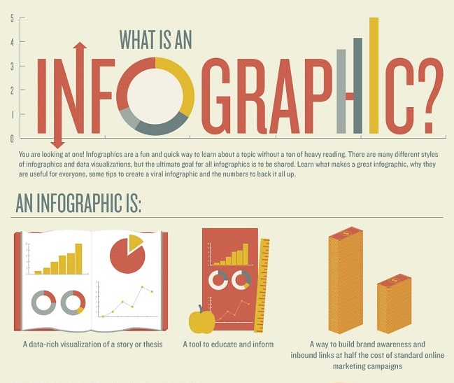
So now what are some tips to get your out and read? Well, to be honest like everything in life there is no one correct answer. It really depends on the message and who you are trying to reach. There are numerous infographics out there on TV and the web. Go to Facebook, LinkedIn, Twitter, or any other social media site and you’ll have plenty examples. Some are examples of how to create good infographics, while others are examples of how not to create them.
So here are few simple tips to follow:
- Keep it simple. They should be concise, clear, and easy to comprehend.
- Showing relationships can really help people understand your concept. Some like comparing good driving records to bad or changing clothing trends.
- Stay on topic and stay focused. Even though the bigger picture of your topic might be full of other good information, stick with one key topic. Don’t start your topic with tips on how to maintain a good safety rating, and then go into getting a good load, and then go into proper maintenance. Stay on point.
- Understand the importance of colors. Colors can actually guide the reader to the mood you’re wishing to get. Bright colors are more for positive feelings. While darker colors convey a more negative feeling. Make sure you background doesn’t swallow up the text either.
- You must ensure the proper layout. These aren’t meant to be viewed as you would a newspaper or even a graphic novel. Make sure the flow leads the reader to each point in the order you want. But feel free to mix it up, use images, charts, drawings, and icons. Don’t overdo the fonts; stick with two or three max. One other thing, if it is yours always includes your company logo.
- Keep it appealing, that doesn’t mean the topic itself must be happy and cheerful. What that means is when the reader is looking at it feels comfortable. You shouldn’t include external links that the reader must click. It is ok to all the reader to click thumbnails to increase them (as long as the image is there). Don’t clutter it up with too many images like some grade school collage.
- Be factual and be able to have the information verified. It is ok to give opinions (if stated as such) and it’s ok to round figures (just note approximate). But if you use facts a figures give a source so that people can look it up and learn more if they wish. Always cite your sources for your images, charts, quotes and anything else not written by you (or your staff).
Well hopefully this has given you a better understanding of infographics and how they are used. When creating them you learn there are numerous concepts and ideas so go with what feels best to you. The only point I will stress is that they are meant to be informative and easily understood.
Source: www.protectmycdl.com


